Cracknell Law —
Brand Strategy, Brand Identity + Print


Background
Cracknell Law’s partners set out to create a new type of practice. A practice which sought to avoid the flaws and client frustrations of more traditional corporate law firms.
A retainer system and a laser-focus on business law, allows Cracknell to truly partner with clients, whilst offering the assurance of fixed costs. With a push into the congested London markets on the horizon, to set them apart would require a strong new proposition and brand identity.

Defining the Proposition
I introduced 'Make Certain', the short-form proposition which became the foundation for communicating the clarity and assurance that Cracknell's clients can expect from their targeted services.


A Link to the Past
The firm's original stag head logo was redrawn into a new mark which juxtaposes the traditional with the modern. This helps to maintain the equity from the previous icon, whilst representing both the protection they offer and the fluidity of their service.

Cutting Through
The strength of Cracknell Law’s offer is not what they add - it’s what they cut out. To communicate this directly, yet playfully, I introduced strikethroughs into the copy.


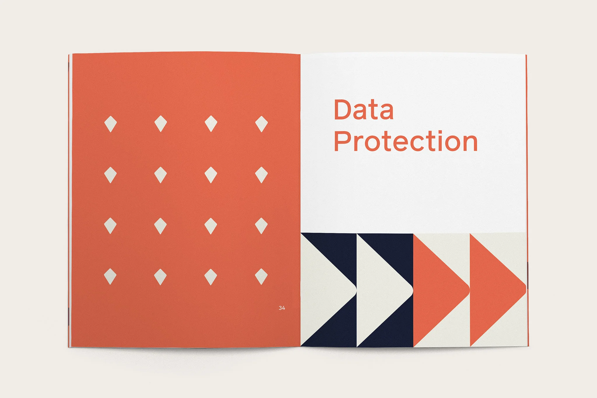
Flowing through
Graphics and patterns formed from the logo are used to create icons, signpost actions and depth to the branding.


